Tuesday, November 18, 2008

Colour Predictions for AW09 - Suitable for the Miu Miu Brand?

After considering my initial choices of inspiration for Autumn/ Winter 08, I decided to research current on-trend colours that could be developed for the next season:


The colours here are too washed out and tonal for Miu Miu purposes - the brand focusses on far more high energy and impactuous colours, however the BISCUIT colour (Pantone 13-1014) may be suitable for the neutral beige that constantly features within the collections as shown here in SS09. DUSK could be incorporated by raising the chroma slightly.


This colour set is more fitting for Miu Miu, the colours entitled SEVRES, TEA, DOVE and MUD have
a medium to high chroma to be suiable for the brand but are moody enough to fit with the theme of New
Wave Dadaism, as seen in this artwork by Hannah Hoch. However the colours may be in need of tweakng as some are very similar to AW08, especially the PEA (Pantone 17-0235) and MUD (Pantone 19-1420)


The ABSINTHE, GROUNDNUT and COQ shades in this colour palette represent the theme well, being commonly seen in Dada works with COQ, ABSINTHE and DUCK EGG being at the cooler end of the colour spectrum; harmonious and monochromatic. The MAUVE, PLUM, GROUNDNUT and DOVE tones being warmer and more regal, seen in previous Miu Miu collections such as Spring/Summer 08 would link well to the brand and have been incorporated into patterns as show to the right.


Very neutally based, the PITCH, SONE and TOMATO colours remind me of the red, white and blue short tu-tu style dresses from the SS08 collection. There is not enough variance between colour here, the TOMATO being the only Pantone to grab attention - Miu Miu's colour palette has numerous attention grabbing and clashing colours within. The SLATE and CARAMAC tones are suitable for a base colour of the collection as they contrast well together, the grey being cold in value and saturation, the golden brown warm and rich. Bote tones are commonly found within the Dada theme.


Much more suited to the Miu Miu colour palette, these bright and acidic tones are definitely high chroma, high value, attention grabbing as seen in the harllegquin style SS08 collection, clashed togther to create a high impact. The only factor to consider here is the need to apply the colours to the Dada theme - these bright, cartoon-like colours would not have been used at the time however tones such as ELECTROPLAST, ULTRA-VIOLET and SPEARMINT are suitable as a modern twist on the theme. Perhaps if the chroma, saturation and intensity were reduced in some colours they could be incorporated into the palette and be more appropriate for an Autumn/Winter collection.


To summarise, the Dada movement uses varying shades of mushrooms and warm beige in abundance alongside neutrals such as black and slate. This fits well with the Miu Miu brand as these colours are key to each collection and used in high proportions throughout. Mid chroma colours such as golden browns and corals are accentuated with high saturation violets and underscored by burnt reds, dark turqoises, plums and muddy browns. As a result, a provisional colour palette for Autumn/Winter 2009 can be presented as shown.


Monday, November 3, 2008

Colour Proportions

Considering the main colours incorporated throughout every Miu Miu collection include a majority of black and beige colours, with brighter hues of blue, orange, greens and purples, it is vital to keep the continuity of not only the brand's colour philosphy but also proportions and apply this to future collections.

For the coming Autumn/Winter 2009 season, trend predictions feature gothical glamour stylings with inspirations from the 1980s New Wave gothic rock scene of long and lean leg lengths with a more voluminous top half
.


Mushroom inspired silhouettes featuring accentuated hip shapes that highlight the womanly curves of the body, alongside skin-tight, high-necked polos and blouses. These trends therby suiting the Miu Miu base colours of black and beige, and will have a big impact on other highlighting colours within the Miu Miu colour palettes for the season. Related to predicted themes, colours for AW09 could include:

black / bold violets / mushrooms / copper / slate / peach / eggplant greens / dark turquoise

Also considering the trend predictions, not only colours of fabrics but textures will play a big part in achieving the main looks for AW09/10 - iridescent pearl colours in lilacs, peaches and eggplant green voiles will be contrasted by roughed up and texturised black and grey leathers and performance fabrics; copper and mushroom sateens next to attention grabbing dark turquoises and violet jerseys. These combinations of seemingly unrelated colours and fabrics fit with the Miu Miu design philosophy of a 'vivid colour palette, with unnatural tones' with 'fantastical imagery' in the form of floaty, almost fairytale like fabrics juxtaposed next to toughened leathers and textured thick, blended fabrics. All emphasise the 'femnine styling' whilst remaining fashion forward and targeted towards a slightly younger demographic.

Colour Palettes of the Miu Miu RTW Collections - Final Proportions

Throughout Miu Miu's collections there is a notiable pattern in methods of application of colour. Collections are divided into 2, adopting different colour groups, varying between hot and cold colours. This creates a strong contrast in each collection and reflects Miu Miu's brand philosphy, where there are many different ways to define a woman.


Spring/Summer 2007

In line with Spring, Miuccia Prada considers Russian constructivism, as well as the elegance of an elongated line. Duchesse satin shirts and tunics color blocked in shades of navy, black, and wine, worn with high-waisted tapering pants are common in this collection. Dresses with touches of Africa (tribal prints) and Japan (origami-like folds of shiny fabric decorating the shoulder or hip) are a dominant look.


The entire collection

Navy is the most dominant colour used, occupying approximately 60% of the collection. There is a variation of the navy, as Prada uses differnt shades and tones of blue. The navy is often teamed with black to create subtle contrast, or paired with a high value, high chroma, blood red which gives a dramatic effect.

Tints, tones and shades of red are used throughout the collection, with approximately 20% of the outfits having red incorporated into its design.

20% of the collection includes white as a block colour. This creates a contrast against the rich high chroma hues. Using a lighter tint reflects the bright feeling of Spring/Summer.

30% of the collection uses BLACK and this is commonly paired with navy and other shades and tones of blue.

25% of the collection uses different tonal variations of the hue purple, which compliments the red.

Approximately 20% of the designs are patterned and 80% use block colours.

Pantone Colours:


The common principle applied in this collection is the Principle of Order, where there are lots of variations of the same hue. This creates a monochromatic effect. For example, the hue of red is used in the collection, however differnt shades and tints of red are also used, such as plum, wine and burgundy.


Autumn/Winter 2007

A sample of the collection

There are variety of tints, shades and tones of brown used in approximately 43% of thecollection

1/3 of the collection is made up from black, including tones of grey

15% of the garments are red. Tones of orange are also used, but it is hard to differentiate between the two, as the variation of orange in its secondary form is so subtle. Tints of pink are also prominent, however it is used more sparingly.

Blue is used to add contrast to the warm colours in the range, making up only 6% of the garments. In this case, it is used as an accent to the collection and creates variation and interest.


Autumn/Winter 08


A sample of the collection

Just over 90% of the collection features black as well as tints and tonal variations such as grey. Black is used as a base colour and as a block. It is used to accentuate the collection and add depth. It also creates stark contrast with the high value, high chroma hues of green and orange.

25% of the collection incorporates different shades, tints and tones of the hue green into the designs. Different shades of green are paired together in a lot of the outfits to give a monochromatic effect, creating fluidity and harmony. However, green is often teamed with black for dramatic contrast, which adds emphasis on the high value of the colours.

Orange: 18% The orange used in this collection has a very high value and high chroma. This creates a strong and vibrant contrast between the black. Teaming contrasting high and low values like this gives a dramatic effect and falls in line with the exciting sports/futuristic feel of the collection.

Red accounts for 15% of the collection. Here, Prada applies the Complimentary Colour method, where red and green, two colours opposite on the wheel are paired together. The red used is a high value and low chroma, creating a rich wine tone. This adds to the aggressive and receeding feel of the collection.


Spring/Summer 09


Black dominates this collection, being featured in 56% of the designs. It is used mainly as a block colour, but is also applied to the designs as a small feature, such as on accessories to accentuate other colours.

Brown is dominant colour used in this collection with variations of lighter tints such as beige and cream. This makes up for approximately 1/3 of the collection.

Red is used as an accent in this collection, being featured on only 8% of the designs. It is used as a point of contrast, being paired with black to add an aggressive and warm feel.

Prints are featured heavily in this collection using pink, yellow, red, black, blue and orange. This adds a light, Spring feel to the collection and contrasts greatly with the dramatic use of high value blood red and black. Prints make up 38% of the collection and adds an African theme. The collection appears to be split into two: plain and patterned. Bright patterns and colours used in the prints and bold blocks of red and back are used in the plain.

Summary

Overall, the key colour combinations used throughout the Miu Miu Collections are:

Red + Black

Brown + Beige + Cream

Accenting Colours = Green + Orange + Blue

Identifying Colour Ratio to the Collection

We have split the collection into two parts that have two very different colour palettes. The first part consists of much more vibrant hues with bright primary colours mixed with maroons, black and teal. These colours all have a dramatic intensity with a high saturation making them quite unnatural and not life like colours. The darker colours that are paired with the bright primary colours have a very low value with shades of black added to them to create a dull hue. Several of the outfits are given added intensity as the bight colours are often strongly contrasted with black in the collection. The second colour palette is more subtle with creams, moss, baby pink and mauve and all have quite a low intensity. These colours have a more subdued effect on the whole collection and this creates a complete contrast with a delicate feeling of sheer fabrics, soft prints and fine details.
The collection is brought together by the silhouettes and the constant length of the dresses, high-waisted skirts and bloomers which are all extremely short. There are only 3 pairs of trousers in the collection and they are all straight legged. Miniskirts teamed with sheer bibbed blouses and a beautiful voluminous cape, before volume creeps into the bottom half of the silhouette with springy tutus that flare out from the waist to hip with a flash of the bloomers and miniskirts underneath. The key detail punctuating the collection are the collars, chaps and cuffs that are often detached from the clothing, and are a modern take on the short lace gloves favoured by Madonna in the Eighties. This is a typically style of Miu Miu to add such a quirky detail to grown-up blouses and shift dresses. This also reflects the main theme of the collection with a theatrical circus like inspiration as a fantasy wonderland is created with extremely short harlequin style dresses that are illustrated with a female face.
The spilt colour palette reflects the principal of novelty that states even though people like a harmonious colour scheme that is balanced the harmony quickly becomes boring. Therefore an unforeseen colour combination can make the collection more desirable and harmonious. The theory of novelty also fits in with the brand identity and philosophy of Miu Miu that every colour is not what you would expect, and shows the playful side of the label. The entire collection fits Miu Miu's vision which is to bring theatre to life and to dress for a performance; these pieces are about dressing up and showing your creative side.
Furthermore the collection is broken down into a monochromatic scheme with an outfit with shades of green, an achromatic scheme with black and white outfits and outfits with the colours form the same colour palette.


Purely white outfits were contrasted with bright shoes.

A bright red with high intensity paired with black for greater contrast and effect.


These three outfits used the same colours paired with black.
The unexpected high intensity colours and the style of the harlequin dresses with faces on them also reflect the Surrealism style from the 1920s, particularly from Salvador Dali’s work. Salvador Dali was a Spanish painter and was best known for his great imagination with striking and bizarre images in his surrealist work. He also paints faces and objects that have been distorted that are similar to the feeling of Miu Miu’s faces on the dresses, and his objects were inspired by blocks of melting cheese.


As well as playful and beautifully created garments, the accessories also stood out and almost stole the show with clutch purses so small they were almost invisible in the models’ hands. The outfits were also accompanied by Art Nouveau inspired shoes with platform shoes growing into boots as the collection proceeded. Art Nouveau is characterized by organic, especially floral and other plant-inspired motifs, as well as highly-stylized, flowing curvilinear forms, and these forms on the shoes were often infused with a mixed colour palette like the outfits themselves.


Art Nouveau inspired shoes with the same colour palette seen in the outfits.

Art Nouveau inspired boots that were paired with extra short miniskirts and bloomers to create an incredibly quirky touch to an already eccentric coloured outfit.

Miu Miu - The Brand

In order to truly understand and identify Miu Miu as a brand, intial research was carried out, looking at the history of Miu Miu, previous advertising campaigns, the Miu Miu store and previous RTW Collections.

Miu Miu: Background

Miu Miu is positioned as a fashion-forward yet more affordable line from Prada, named after Miuciana Prada’s nickname as a child. Set up in 1992 Miu Miu reflects a younger demographic including artistic designs, often simplistically conveyed by means of vintage-inspired styling. Considering the so-called ‘Ten Year Cycle’ of fashion - by incorporating pieces and looks from historical periods, rejuvenating, reworking and contemporising the styling just prior to the ideas being taken on by other major brands - Miu Miu remains as a dictator within its market.
Within the collections, childhood inspired elements blend with unnatural colour combinations in a fantastical but somehow sensual world. The philosophy behind Miu Miu reflects the multi-faceted nature of the brand, how “Miuciana Prada’s vision of the Miu Miu woman is continually redefined”, utilising each seasons’ collection to make commentary on current social or political issues of importance to her and establishing a “complicated feminine ideal”.
The brand philosophy continues to classify the typical Miu Miu styling:“Where ingrained elegance meets immediacy and lightness. Where independence, improbably, meets sensuality. Where sophistication meets nonchalance.”
These contrasts in terms illustrate the somewhat eclectic nature of Miu Miu collections, how any expectations of the brand can be disregarded apart from the knowledge there will be a visual feast in store!


Considering the Miu Miu brand philosophy, the Spring 2009 Ready-To-Wear collection did not disappoint in artistic flair. "An investigation of our history, of our European past" is how Miuciana Prada described the newest show in Paris, with prints on dresses and blouses reflecting Roman printed tiles in terracottas, camels, midnight blues, corals, greys and yellows. Normally employing colour theories including principles of novelty and alternations and contrasts of colour, this collection veered more towards the principle of resemblance, some colours harmonizing well with accents in exaggerated tones to highlight accordingly. However eccentric abstract floral prints were combined with pleats, graffiti style spray paint embellishments and apron style adornments in an eclectic palette of colours. Neutrals included a mushroom beige and black combination throughout with bright pinks and lilac grafitti, reds to highlight and yellow and terracottas within the Roman-style prints. Linking the current collection with European history of Rome and Italy, Miu Mui collections are also reminiscent of the artist Salvador Dali in their quirky surrealism, schizophrenic changes in colour and fantasy shapes and contexts.


However all collections share qualities of artistic origin; most significantly the Spring/Summer 2007 collection with sexy harlequin and circus inspired styling. Dresses were adorned with caricature faces, were reminiscent of pop artists such as Lichtenstein and Warhol in the combination of highly chromatic and exaggerated colours, maximizing the principle of novelty throughout.


Also in terms of culture Miuciana Prada is known to incorporate current social issues into her collections, one past range commenting on the artificial nature of women aspiring to unreachable levels of perfection; another on the theatrical nature of life as a show. Within the latest Spring 2009 RTW collection, hemlines are low, falling below the knee which reflects the current social economic climate (it is said that in times of wealth skirts will be short, and in times of recession hemlines will be lower). This economic climate is also reflected in the lack of so many ‘avant-garde’ pieces; most were sexily simple and more classic in design, rendering their life-in-service longer and more appealing in times of an uncertain future.
Considering Miu Miu’s brand philosophy that the Miu Miu woman is continually reinventing herself the design process will be relatively free and open to interpretation, designing a collection for Autumn/Winter 2009 will be based on the following main principles:


1. reliance on cultural symbolism
2. conceptually artistic inspirations
3. childlike metaphors
4. feminine styling
5. fantastical imagery
6. vivid colour palette, with unnatural tones
7. commentary on social issues


Miu Miu: Advertising Campaigns


Advertising campaigns are also an interesting way to interpret the designer’s direction for the season. Miu Miu’s advertising campaign for spring 2008 uses a balance of colour and a variety of hue. Both light and dark values, bright and dull intensities have been used which all balance the colour scheme. The red floor has a high value due to its dark colour and shade which contrasts heavily with the high chroma purple curtain. The matt and shiny textures of the colour mix well and give the image a feeling of seduction and playfulness. I really love how the image can convey a feeling about the collection without seeing the more than garment. It gives emphasis on the importance of colour within fashion design and how an advertisement can portray the inspirations and aspirations behind one season’s collection.


The colours used throughout the Miu Miu autumn winter campaigns are reflected as unnatural. For example the blue used for the sky and the grey used for the tarmac are not ‘lifelike’ but unnatural and accentuated colours of nature and the natural world as we know it. As a result there is a strong emphasis placed on colour and the contrast between the pale skin on the model and the acidic red of her lips. The colour palette used creates intensity and highlights the relationship and interaction between the light source, background, colour and object colour. It almost gives a cartoon, surreal feeling to the advert. There is a more childish and vivid element which links in heavily with the brand and its ‘atmospheric’ former collections which represent a more fun youthful side of fashion.Looking closely at the advertisements there is also a strong link with the mid 1950’s pop art movement. Pop art was all about popular culture and challenging and distancing the mass market for a dramatic effect. There is an everyday element to Miu Miu’s advertisement above yet it has been challenged by the use of colour and therefore become more aggressive. This can be related to many pop artists one of the most influential being Roy Lichtenstein, and example of his work can be seen below; 1963, ‘In the Car.’


It also ties in with Miuccia Prada’s vision of the brand and her strive for a alternative style, characterised by the brands strong identity and unique hand writing. However the style still remains classic, it is simply just reinterpreted and updated, 'Miu Miu is always more about fashion than Prada, more about atmosphere, more sensual. It's light and free. Not serious. Age is not really fundamental; the spirit is more important than age. It's more the idea and the spirit that counts.' (Miuccia Prada)Each past and present collection tells its own story and the vision of the brand is constantly being redefined. The brand is designed for women who cannot be defined, it isn’t ‘safe’ in terms of use of colour. Miuccia Prada was an early feminist and this is reflected in her designs from season to season, as well as strongly reflected in each seasonal advertisement. Nothing is reserved about her designs; it is all about shape, lines and bold use of colour. The brand plays on the fact that there is no feminine ideal. Spirit strongly overrides age, with age no longer becoming a fundamental element; the brand is based on ‘Child Women.’ Miu Miu store in Hong KongThe Miu Miu store in Hong Kong uses a bright feminine hue with high chroma which gives the feeling of a light, bright and spacious building consequently drawing consumers into the store. The colour yellow is also associated with summer and happiness therefore the familiarity and associations with this colour are pleasing and readily accepted, as a result the mood reflected is one of radiance and pleasure. Customers will be more likely to enter the store and purchase feeling satisfied, the perception is positive. This also relates to the youthfulness of the brand and its image.


Friday, October 10, 2008

Analysing Personal Colour Choices


Analysing celebrities colour choices can speak volumes regarding their cultural backgrounds. I studied the clothes and accessories of three celebrities from contrasting backgrounds to see whether there were any patterns betweeen their colour choices:
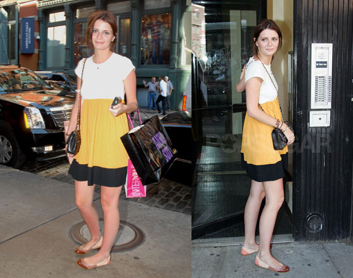
Actress Mischa Barton's style is a little eccentric; mixing patterned prints with unusually colour-coordinated separates giving a bohemian and hippyish look. This perhaps reflects her upbringing - moving from London, where she was born, to New York at the age of four. Her mother being a photographer may have also played an influence on her appreciation for creativity and experiementation, reflected by the colours of her clothes and accessories. Often seen wearing bright acidic colours of a high chroma level, she favours tones of lime, turquoise and yellow, often combining with gold accessories for a harmonious and analogous combination of colours.


Mischa Barton also favours cooler shades of deep purple and blue, often mixing harmonious tones together. Mischa often selectes darker and cooler shades for evening wear as a contemporary updated look of colours that could, if worn the wrong way, appear tedious and boring.


Indian actress Shilpa Shetty symbolises typical Central Asian fashions, wearing both traditional and contemporary pieces in high chroma and high value colours. Her background being Indian conjours up rich and vivid shades, often wearing magentas and cyan hues.


Shilpa Shetty also selects cyan hues in vibrant shades which reflects her cultural background in a Western update of Indian traditional wear. Dresses in long flowing shapes reminiscent of saris are decorated with gold embroidery and detailing, jewell embellishments and combined with animal print fabrics in a modern twist of traditional dress.


Chinese actress Huang Shengyi favours wearing lighter tints and neutral hues rather than bright and bold colours, perhaps linked to the cultural preferences of Chinese fashions that pastels are more appealing than brighter shades.